Mike Wooskey@lemmy.thewooskeys.com to Mildly Infuriating@lemmy.worldEnglish · 4 months agoVague design choicelemmy.thewooskeys.comimagemessage-square27fedilinkarrow-up1219arrow-down111file-text
arrow-up1208arrow-down1imageVague design choicelemmy.thewooskeys.comMike Wooskey@lemmy.thewooskeys.com to Mildly Infuriating@lemmy.worldEnglish · 4 months agomessage-square27fedilinkfile-text
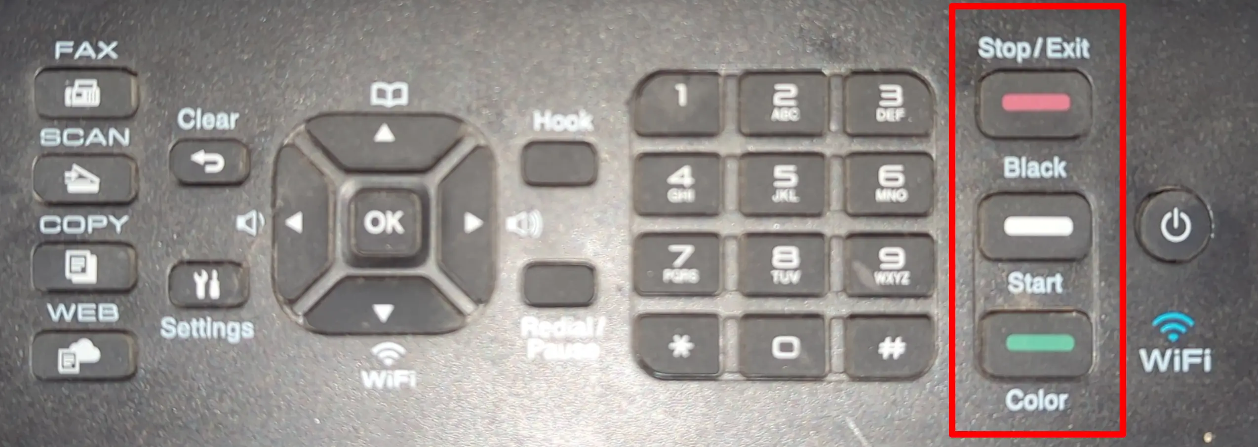
minus-squarehakase@lemmy.ziplinkfedilinkEnglisharrow-up55arrow-down3·edit-24 months agoThis is the correct answer. There’s even a slight plastic indentation to let the user know that both of the buttons in question are “start” buttons. I think the design is fine.
minus-squareTolookah@discuss.tchncs.delinkfedilinkEnglisharrow-up35arrow-down2·4 months agoThat’s also how I saw it. Nonetheless, that’s really poor design.
minus-square_stranger_@lemmy.worldlinkfedilinkEnglisharrow-up14arrow-down1·4 months agoI didn’t notice the indent until you pointed it out. It’s probably slightly more apparent in person


This is the correct answer. There’s even a slight plastic indentation to let the user know that both of the buttons in question are “start” buttons.
I think the design is fine.
That’s also how I saw it. Nonetheless, that’s really poor design.
I didn’t notice the indent until you pointed it out. It’s probably slightly more apparent in person