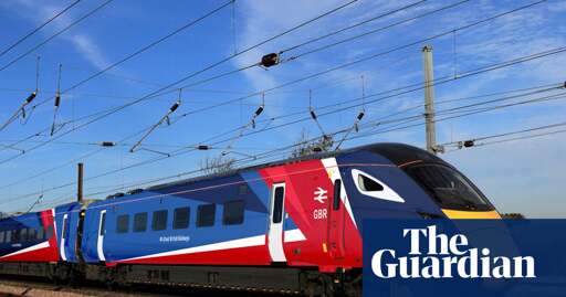
The geometric design thing can sometimes look quite generic, like not quite original enough to really stand out and also not quite the classic look of a solid colour. But then I think this one looks decent enough.
Of course I’m not a designer or anything and I’m thinking purely about how it will look on a Hornby train set.
It’s been the logo forever. Even when the trains were nationalised it was still the symbol for a train station, it’s become somewhat of an international symbol for a train even in countries without context.
Because there’s only one thing better than a good design (not that I’m saying it isn’t a good design) and that is a standard.
For better or worse that’s the iconography that means trains. There’s no point in trying to change that.
Ah sorry I was talking about the train livery. You’re right, I don’t think the logo will be unpopular